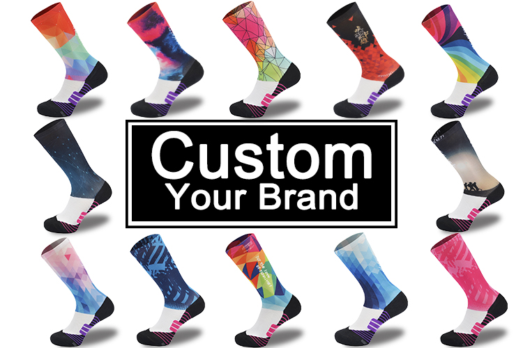
Why Sublimation Socks Are the Ultimate Branding Canvas
How dye-sublimation creates photorealistic, edge-to-edge designs on performance sock fabric
The dye sublimation process actually works by bonding custom designs right into the polyester fibers of socks when exposed to heat and pressure. When things get hot enough under controlled conditions, those solid dyes turn into gas form and work their way deep into the fabric threads at a molecular level something that just doesn't happen with regular printing methods or stitching techniques. What this means is colors become embedded throughout the actual fiber itself, which allows for complete edge to edge coverage across the entire sock surface. The result? Smooth gradients without harsh lines, intricate details that stand out clearly, and absolutely no visible seams anywhere. Since the dye becomes part of the material rather than sitting on top like paint does, these designs stay vibrant even after countless washes and intense use over time. Plus, unlike other methods that can mess with fabric properties, sublimation keeps all those important performance characteristics intact. Moisture wicking stays effective, stretch remains consistent, and breathability isn't compromised at all. That makes this technique especially good for sports gear where both appearance and function matter equally.
Comparing sublimation socks vs. embroidery and screen printing for durability, flexibility, and visual impact
| Feature | Sublimation | Screen Printing | Embroidery |
|---|---|---|---|
| Durability | Fade- and crack-resistant | Prone to cracking under stretch | Threads may unravel over time |
| Flexibility | Maintains full elasticity | Stiffens with repeated wear | Adds bulk, restricts stretch |
| Visual Scope | Full-wrap, 360° coverage | Limited to flat, non-stretch zones | Restricted to small, low-profile areas |
| Color Detail | Unlimited gradients, photorealistic tones | Typically limited to 8 spot colors | Minimal tonal variation; no gradients |
When it comes to branding that looks good and works well together, sublimation really stands out. Screen printing just doesn't hold up when socks get stretched during actual wear according to research from the Ponemon Institute back in 2023. Embroidery creates those annoying pressure spots on feet and generally makes wearing gear uncomfortable over time. What makes sublimation so special? It gives athletes vibrant, full color designs all around their gear that actually moves with them instead of pulling or bunching up. That's why so many sports teams are switching to this method these days for their uniforms and equipment. The graphics stay intact through intense training sessions and competitions without fading or peeling off, which keeps the team looking professional throughout every game.
Ensuring Color Accuracy and Uniform Cohesion with Sublimation Socks
Translating PMS/RGB/HEX Brand Colors to Sublimation-Ready Files: A Practical Color-Matching Workflow
Getting accurate colors right starts long before hitting print—it's all about proper file setup first. Begin by using Pantone references as actual samples to work from, not just numbers on a screen. Then take those digital files in RGB or HEX formats and convert them properly to CMYK profiles that actually work well with polyester materials. Never skip checking printed samples under different lights similar to what they'll face in reality, like stadium lighting or natural sunlight. Colors can look great together under office lamps but totally change when viewed elsewhere due to something called metamerism. The best production houses use ICC profiles to get printers, inks, and fabrics working together smoothly, which cuts down noticeable color differences by around three quarters compared to regular screen printing methods according to recent research. When done correctly, this attention to detail keeps brands looking consistent on all parts of uniforms without those annoying mismatches between collar edges and faded trim details that make everything seem cheap and unprofessional.
The Role of Sublimation Socks in Completing Team Uniform Systems
Sublimation socks aren't just something tacked on at the last minute. They complete the look when building out a full brand presence from head down to toes. These socks fill in the space where jerseys meet shoes, keeping everything looking cohesive with matching colors, repeating patterns, and designs that flow together smoothly. Traditional methods like embroidery or screen printing can't match what sublimation does for continuity. Imagine those cool stripe designs running all the way from a player's arm down past their ankle, or geometric shapes that look good no matter which way someone turns. The best part? None of this takes away from comfort or flexibility since there's no extra bulk or rigidity added to the fabric. According to a study published in Sports Branding Journal back in 2023, teams wearing completely sublimated gear saw fans recognizing them 40% quicker than before. That kind of visibility makes these socks much more than just foot coverings they become valuable tools for brand exposure.
Strategic Customization: Logos, Patterns, and Personality Without Compromise
Design principles for high-recognition sublimation socks: scale, contrast, and repetition guidelines
Good sublimation socks need to look great while still working properly during exercise. When placing logos or icons, size matters. The sweet spot is around 1.5 to 3 inches across right above the ankle bone area where the fabric doesn't stretch much, so designs stay clear even when moving around. For visibility, go bold with color combinations like navy on gold or black with neon accents. These contrasts cut through sweat stains and changing light conditions during workouts. Patterns that repeat themselves help people remember brand marks better. Think stripes that follow a rhythm, geometric shapes that line up nicely, or words spaced out in a way that guides the eye without getting too busy. And don't forget about how dense those patterns are. Around 30 to 40 percent coverage works best in areas that stretch a lot, keeping air flowing through the sock material and avoiding that blurry mess effect when stretched out during activity.
When less is more: Avoiding visual clutter while maximizing brand memorability
When things are moving fast, simple designs get noticed first. Studies from Textile Design Journal back this up, showing cluttered visuals can cut down on people remembering them by around 60% in 2023. That matters a lot for logos that need to stand out while someone is running or jumping. Focus on just one main element when creating these kinds of designs. Maybe go with something like a simplified mascot, a compact text logo, or an iconic symbol that represents the brand well. Stick to no more than three primary colors for the color scheme. Also important is leaving plenty of empty space across at least half the design area. This white space helps draw eyes where they should go and makes the overall look clearer. Adding gentle color shifts or tiny textures gives depth without making everything confusing. What happens then? Brands become much easier to spot quickly, work better during active moments, and stay in peoples' minds longer. Research indicates clean athletic branding actually improves memorability almost three times over busy alternatives according to recent findings.